Incentro
At Incentro things are anything but ordinary compared to your average IT company.
When Verve, a global design agency, came in with their "Business as Unusual" rebrand, they handed us a golden ticket to think differently. Verve laid the groundwork with a fresh brand guide, and that’s when I stepped in to design a bold, digital experience.

Process
From bold ideas to a bold website, here’s how I took that vision and turned it into a digital experience that’s anything but typical.
1. Translating the brand guidelines into digital principles
Think of this as turning the big picture into laser-sharp focus. The new brand had a strong identity, but it needed rules for the digital world—what works on a website, how users will interact, and how to stay true to the brand while staying intuitive. These principles became our north star for design decisions. The design principles included dynamic and bold cell shapes to represent adaptability and innovation. Interactive elements that change shape, illustrating how Incentro's solutions are unusual and ever-evolving.
And people or so called “Incentronauts” at the core, showcased in the unusual shapes.
2. Designing with purpose
Next came the exciting (and sometimes messy) design exploration phase. With Jeroen, our UX wizard, we mapped out user journeys to understand the "why" behind every click. Then it was time to create concepts, balancing strong visuals with functional UX. Every design exploration was like a daily mini pitch, making sure we were on the right track to evolve.
3. Building the design system
This is where it got nerdy (my favorite part). From colors, fonts, and icons to full-blown components, everything went into Figma with love and precision. The design system was constantly growing and evolving into place, being the backbone of consistency, scalability, and developer happiness.
4. Components that play nice together
As the design system grew, it became an ecosystem of reusable components. Buttons, cards, modals, you name it. We added variations for every scenario, ensuring they weren’t just pretty but practical. Auto-layout was my best friend, so developers could see the pixel-perfect spacing in every element.
5. Sticky notes, handoffs, and dev love
Handover time! Figma became a treasure map with sticky notes galore, guiding developers every step of the way. I made sure questions were always welcome, and making changes for the benefit of the website was okay by me. My ultimate goal was to make sure development could start with fresh excitement on the build.
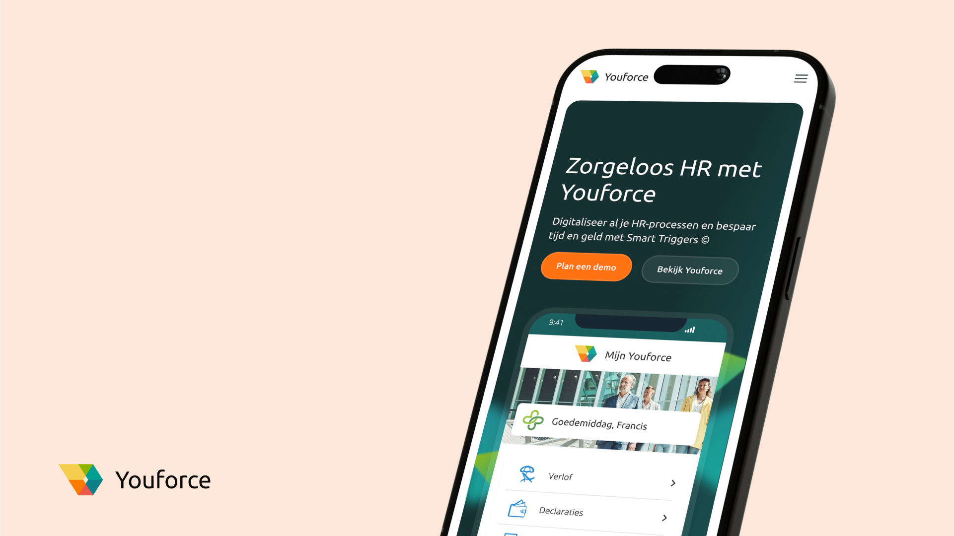
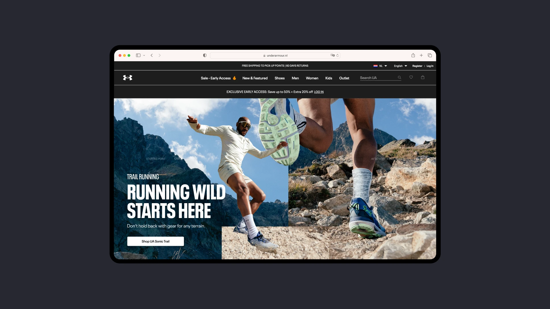
Web design
Design system